
Doctory.
Project Brief.
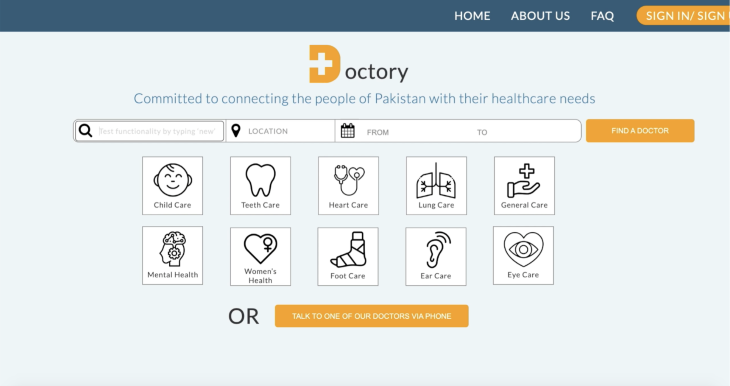
Doctory is a medical platform constructed to help improve the main competencies of discovering nearby and appropriate doctors to treat particular sicknesses. Our team was approached by CEO, Maliha Khalid, to redesign a new website in order for this process to be as seamless & easy to use as possible.
Contributions.
UI/UX, Visual Design, Market Researcher, User Interviewer/Tester.
Context.
Pro-Bono, overseas, client work.
Location of client: Pakistan.
Collaborators.
Laurie Grant and Dylan Straffon.
Stakeholders.
Stakeholder names: Accelerator for Female Empowerment, Das Dach, The World Bank, United Nations Women, United Nations Development Program, Accountability Lab, Halcyon, Ideas for Action, and Yaran E Watan.
Final Demo Video.
Final Mobile Mockup.

Hyderabad, Pakistan
The Project.
The Strategy.
Doctory.
Doctory is a medical platform constructed to help improve the main competencies of discovering nearby and appropriate doctors. Through this feat, Doctory aims to provide a means that offers Pakistani people a more efficient way of approaching healthcare aide.
Internal Business Problem.
Doctory’s main business problem stems from their struggle to connect potential patients with suitable doctors. Doctory is having trouble connecting with their visitors online, which leaves potential patients with a sense of uncertainty about the service entirely.
External Business Problem.
The demographics in Pakistan & the national data available communicate issues that are not catered towards on Doctory’s website. Features are not properly attended to them thus making Doctory’s central job more frustrating for patients to navigate and enjoy.
The Connection.
By identifying both problems, we were able to pin-point present gaps we could attack. Through research and testing, we could help Doctory build trust and cater to the diverse demographic of Pakistan.
Problem statement:
How might we build a web platform that connects people to doctors, while being inclusive of all abilities?
(Factors include: doctors who speak patients’ respective language, taking into account Pakistan’s literacy rates, & promoting easy navigation.)
Objectives.
Goals.
-Redesign Doctory’s web platform. Additional goal is to make it accessible on smartphones.
-Designing an intuitive & attainable platform would not only bring in more traffic, but elongate Pakistani’s life expectancy. Being able to access a nearby doctor to treat an illnesses has the ability to result in an uptick of mortality rate.
Steps.
-Evaluate the current website & asses usability.
-Conduct research.
-Provide recommendations based on findings.
-Develop an improved & interactive prototype.
Research Phase.
| Secondary & Competitive Research |
To further understand the assets we needed to incorporate into Doctory, I first needed to run secondary research. By looking into the demographics residing in Pakistan, I was sure we’d be able to provide solid percentages & statistics that would back up our design decisions to our client.
The following graph shows what we needed to consider when designing Doctory’s new platform (mobile users, please turn your phone sideways) based on population research.
1. Secondary & User Research.
Population 212,215,030
“Half the population does not have reliable access to healthcare and many people travel from rural to urban areas for treatment. Most of them cannot afford to travel or meet other expenses.”
Data Discoveries & Insights.
Through gathering this data & laying it out visually, my team and I were able to comprehend the importance of accessibility and, most importantly, literacy.
Patients often don’t know which specialist they need, so they commonly visit multiple specialists when searching for a diagnosis (an avg. of 5), meaning that 80% of their time & money is wasted when seeking a new diagnosis. They’re also forced to navigate unfamiliar terrain, making lengthy transport another issue.
Literacy led to us toying around with the idea of not only allowing users to toggle between languages, but use images to also get illnesses across. A vast majority of Pakistan is under 15, so including a visual means to explain symptoms was a feature we were interested in pursuing further.
Easy visuals became a large factor in our design.
2. Competitive Analysis.
Medical Platforms:
United | Kaister Permanente
ZocDoc | Healthgrade
Tricare | Anthem
As part of our research process, we made sure to investigate U.S. market medical platforms to see their web structure and carry out a thorough competitive analysis.
The reason competitive analysis was run was to investigate what type of information architecture users responded well to, the existing tools that customers enjoyed, & determine the strengths those platforms excelled in.
Outcomes.
An expanded search feature for things like ailments and symptoms.
An additional way to filter/search outside of the standard search bar.
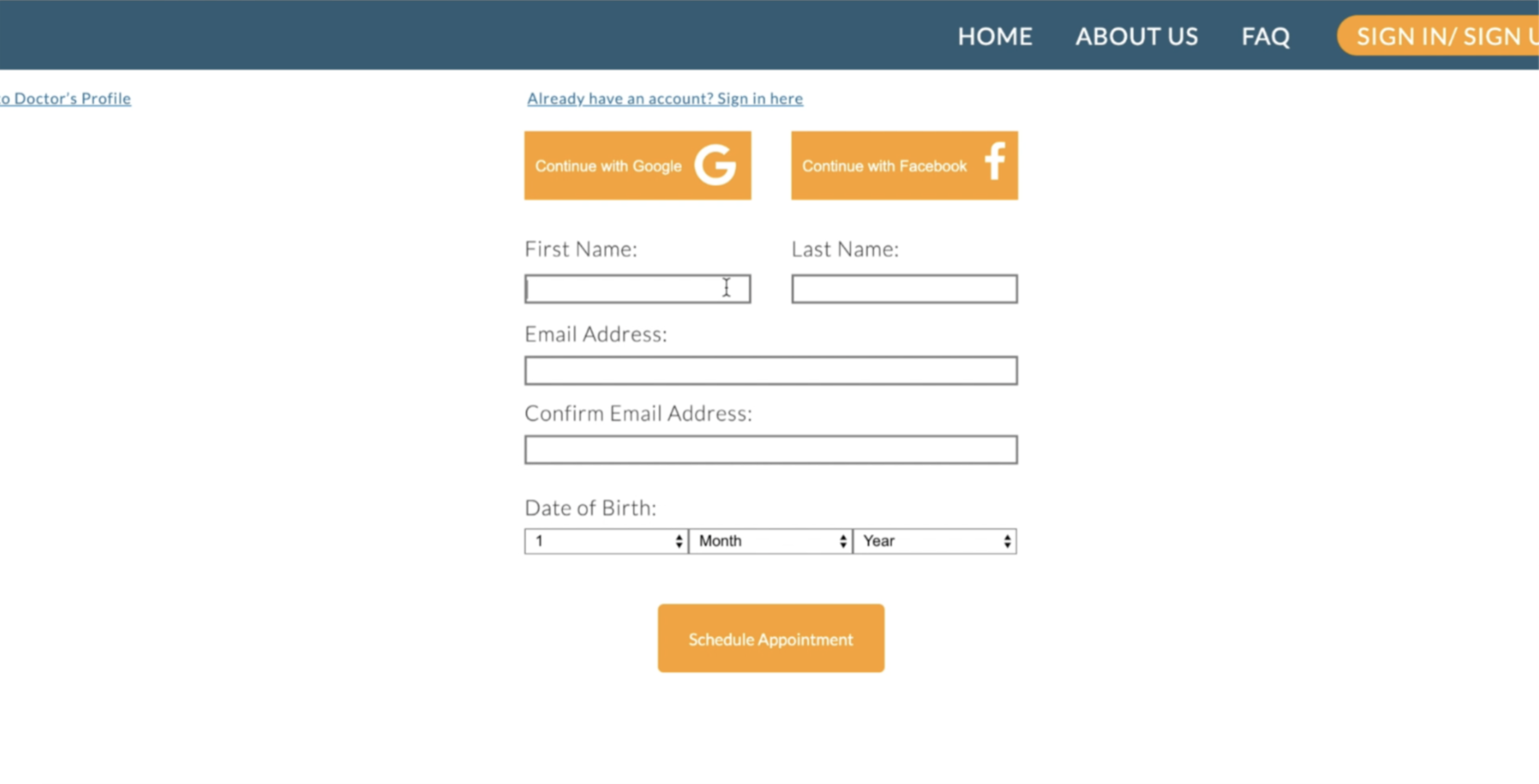
Added ability to schedule appointment directly from doctor’s profile page.
Simplified doctor review system.
Taking our time carrying out research was paramount due to our client being overseas. We were unfamiliar with their environment, so having Maliha provide insight coupled with this research was instrumental when designing for an eastern society.
User Interviews.
Screenings.
Once research was complete, we put together a screening test so we could gather users from a niche group to take part in our usability tests.
Thankfully, we received 40 responses we could put towards our research. Prior to user interviews, it was important that we dedicated our time to define our target audience with an emphasis on ages above 20.
We were looking for candidates who fit the following criteria:
01. Recently visited their healthcare provider.
02. Whether they’ve ever felt a doctor was unclear.
03. If they felt comfortable with their healthcare provider.


Usability Testing.
The goal here was to run a usability test using the “original” Doctory site to understand what users had frustrations with.
This would provide insight to what the motivations & behaviors users have when trying to find an appropriate doctor, along with what missing benefits we can provide them with during our design process.
Our tests consisted of:
Personal difficulties with healthcare professional.
E.g. “When you’re unsure about an ailment, how many doctors do you typically see before you get a sufficient diagnosis?”
Scenarios
E.g. “Let’s pretend your wrist is hurting & you live in Lund, Pakistan…it’s a dull pain, but you’d like to see a doctor. How would you go about finding a doctor? And why him/her?”
This learning strategy of CCAF was based on instructional learning and actions. This means that instead of attempting to comprehend everything on the site at once, participants were encouraged to find particular information.
Results & Key Takeaways.
After my team & I synthesized all the research, user testing, & user feedback, we were able to summarize all key user problems related to Doctory:
Greater Emphasis on Filters.
01. Filters did not allow people to narrow down their search.
02. Disliked inability to sort doctors by location & language.
Improve Search Functionality.
03. You can’t search specific symptoms (“fever” results in Pancreatic surgeon).
04. Search was too limited; forced people to search medical terms.
Enforce Transparency.
05. Landing page needs to state Doctory’s mission statement.
06. Require doctor’s photo (no avatars)/fix blurry photos.
07. Clarify necessary information on doctor’s profile page and clarify ratings.

Islamabad, Pakistan
Prototyping Phase.
Ideation: SiteMap
After listing all the potential features we could implement from our user testing, we were able to create a visual sitemap. This hierarchical diagram helped us outline and flesh out how we wanted to prioritize Doctory’s links & pages, as well as what we wanted to develop later on.
We needed to keep in mind how the information we’ve gathered would be able to flow cohesively & make sure it’s presentation to users was self-explanatory.

4 different possible landing page sketches, 1 results page, & 1 doctors page layout.
Wireframes & Iterations.
After drawing up different wireframes, we first received feedback from fellow designers. We ran our ideas between each other & with other designers, then eventually came down to 3 finalized sketches for each webpage.
We then transferred the sketches to Axure in order to run usability tests on our prototype. We were able to test 5 different users spanning between the ages of 25-60 and across a variety of careers.
Prototype Findings.
01. Landing Page structure for some users was unclear; weren’t sure what unlabeled symbols meant.
02. Filters under search bar should remain pinned when users scroll for doctors.
03. Confusion when scheduling appointments online vs. directly calling.
Following previous prototypes & iterations, we were finally able to come to a conclusion on what Doctory should look like and what it should offer. Below is a slideshow containing the Artboards.


Everything is now behind a wall.
Any doctor or organization that wants to partner with Doctory has to provide their personal information.
Transparency and trust towards doctors is a huge part of the success Doctory is aiming to build towards, and by implementing something as simple as “approval” to join their base, they’ve accomplished an action that would launch their platform even further.
Doctory took in our overall suggestion and in turn, we were able to help an international platform thrive more than ever before.
Reflection & Next Steps.
Looking Back.
I was really thankful to be able to provide ideas and feedback to Doctory. It's a rare thing to have to research another culture, their practices, then use those factors to create something new.
Incorporating culture brought in a different thought process I hadn't used before and by doing this I feel I also had a taste of designing for an eastern society as opposed to western.
One thing I would change is our approach on competitive research. I feel it would have been beneficial to look at the review section on some of those platforms & build our ideas from there. We had a good group of sites we looked at, but I personally think that sorting their online reviews by “Most Recent” may have made a difference in what our design could have offered.
Next Steps.
Like any project, there are some next steps that could be implemented:
01. Build out doctor sign up process & integrate appointment scheduling for them.
02. FAQ could be expanded to include help for medical terminology.
03. Build out the mobile prototype & test its usability.
04. Add more interactive functionality to the digital prototype.

Me presenting to Maliha Kalid, CEO of Doctory